

Video Walkthrough
Please follow along with the video walkthrough below, demonstrating how you can customize display options for embedded SharePoint items.
Customize display options for embedded SharePoint items
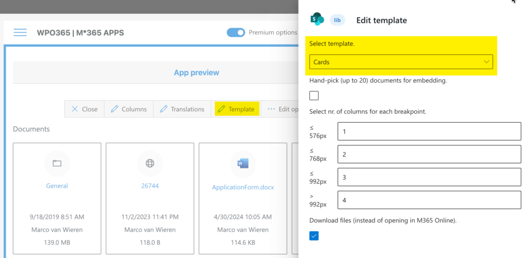
- Return to the M*365 Apps landing page.
- Select the embed-app for which you want to customize the template.
- Click the Preview icon to open the app in preview mode.
- Select the Template option to open the Template Editor panel.
- Change the selected template using the dropdown.
Default Template | Microsoft Look and Feel
The default template is List (default) and it offers the classic Microsoft 365 experience.
- The list columns can be customized.
- The column headers can be configured to support sorting.
- Columns can be dragged to become wider.
HTML Table
The HTML Table is an advanced table that allows you to implement your own look and feel.
- The list columns can be customized.
- The column headers can be configured to support sorting.
- Columns can be dragged to become wider.
Cards
Cards allows you to display SharePoint items on cards that behave in a responsive way depending on the width of the client.
- The number of cards on a row can be customized per CSS breakpoint.
- Optionally can you manually select which items should appear. This is limited to max. 20 items and is not supported for folder items. See the option Hand-pick up (up to 20) documents for embedding.
Download files (instead of opening in M365 Online)
If you check the option Download files (instead of opening in M365 Online) items – when clicked – will be downloaded instead of opened in M365 Online. This is especially useful, when you embedded the library for customers / external users (users that do not sign in with a Microsoft account).