
When you embed an Outlook / Exchange Calendar in WordPress, you can optionally edit the Columns that will be displayed.

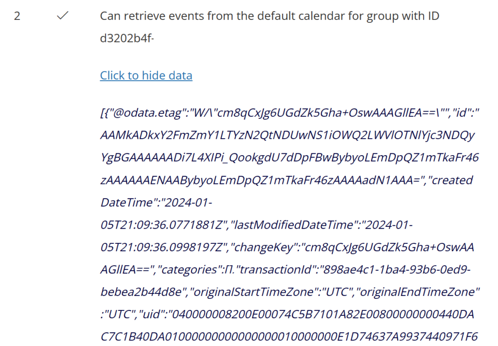
To see the columns that are available, you can simply click to Test configuration at the bottom of the shortcode generator, start the test and then Click to show data.
All columns together are edited by applying changes to the JSON array of column-rendering-info objects. Each column-rendering-info object has a number of properties that are explained in more detail below.
- type The type property tells the block’s column rendering engine what type of column to render. The following options are supported:
- date
- icon
- item (will render as a link to open the item in SharePoint)
- link
- name (will render as a link to open a document e.g. in Word Online)
- number
- text
- field The field property is used to connect the block’s column with a SharePoint list item field e.g. lastModifiedDateTime will get the last modified date and time of the current item. You can use a period “.” to select nested fields e.g. lastModifiedBy.user.displayName to get the display name of the user that last modified the current item. Items that are returned by Microsoft Graph are represented as driveItem resources. The driveItem has been expanded and the SharePoint list item fields are therefore available under the driveItem’s listItem.fields property. For example, to connect to the SharePoint list item’s ContentType field you would simply write listItem.fields.ContentType. To get an understanding what fields are available you can click Start test and then look at the data (by clicking Show data) for the fourth and last test. Copy that data and format it as JSON in your favorite editor e.g. VS Code will help you see how the data is structured and what fields are available.
- hrefField If the column’s type specifies to render a hyperlink then you must add a hrefField property to configure the href attribute of the link.
- hrefTarget If the column’s type specifies to render a hyperlink then you can add a hrefTarget property to configure the target attribute of the link.
- formatStringDate If the column’s type specifies to render a date then you can add a momentjs formatting string e.g. “l LT” or “YYYY-MM-DD”.
- formatStringNumber If the column’s type specifies to render a number then you can add a numeraljs formatting string e.g. “0.0 b”.
- isResizable If true the user can resize the column.
- isCollapsible If true the column may be collapsed (not shown) depending on the screen size.
- maxWidth The max width as a number of the column in pixel.
- minWidth The max width as a number of the column in pixel.
- css A JavaScript object with custom CSS for rendering a column’s cell e.g. { lineHeight: ’24px’, backgroundColor: ‘#c2c2c2’ }.
- title The title of the column.
The following is the default column configuration that serves here as an example and boiler plate for your own customizations.
[
  {
    "field": "subject",
    "isResizable": true,
    "minWidth": 200,
    "maxWidth": 350,
    "title": "Subject",
    "type": "item",
    "css": {
      "lineHeight": "32px",
      "textDecoration": "underline",
      "color": "blue",
      "fontSize": "14px",
      "cursor": "pointer"
    }
  },
  {
    "field": "start.dateTime",
    "formatStringDate": "ddd Do MMM YYYY",
    "isResizable": true,
    "minWidth": 90,
    "maxWidth": 120,
    "title": "Date",
    "type": "date",
    "css": {
      "lineHeight": "32px",
      "fontSize": "14px"
    }
  }
]