

The Customize branding Login / Logged Out Page section allows you to customize appearance of the Login and Logged Out Pages. It only has an effect when at least one of these pages is actually being shown to visitors. This is the case when either the custom login page Change login page to {your website}/wpo/login” is checked, or the built-in logged out page is required, for example when you checked the option Force SSO for the default / custom login page on the plugin’s Login / Logout page and you left the option Use custom Logged Out Page unchecked. If neither applies yet, this section shows a short blue note instead of the options below, letting you know there’s nothing to configure until you turn one of those on.
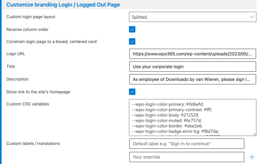
Options to customize appearance of the Login and Logged Out Pages
- Custom login page layout Choose between a single centered column (Default) or a two-column layout with a branding image on one side (Splitted).
- If you choose “Splitted”, a Reverse column order option lets you swap which side the branding image appears on.
- Constrain login page to a boxed, centered card Wraps the page content in a smaller, boxed card instead of filling the whole browser window.
- Logo URL The web address of an image to show at the top of the page.
- Title and Description Short text shown above the sign-in button, e.g. a welcome message or your company name. Shown on both pages by default. Use Hide title on the Logged Out page and Hide description on the Logged Out page if you’d rather leave one or both off specifically on the built-in logged out page.
- Show link to the site’s homepage Adds a small ← Go to {your site’s name} link, similar to the one WordPress’s own default login page shows, on both your custom login page and the built-in logged out page. This gives visitors an easy way back to your site instead of a dead end.
- Custom labels / translations Override any of the page’s built-in text with your own wording, useful for translating the page into another language.
CSS Variables Reference
For anyone comfortable with basic CSS, fine-tune colors and spacing. You don’t need to enter all of them. anything you leave out just keeps its default. See the full list below.
Enter these in the Custom CSS variables box, one per line, for example:
--wpo-login-color-primary: #ff6600;
--wpo-login-border-radius: 0;
Colors
| Variable | What it changes | Default |
|---|---|---|
| –wpo-login-color-primary | The main accent color — the sign-in button and links. | #0d6efd |
| –wpo-login-color-primary-contrast | Text/icon color shown on top of the accent color (e.g. the sign-in button’s label, and text on the branding column). | #fff |
| –wpo-login-color-body | The page’s general text color. | #212529 |
| –wpo-login-color-muted | Softer, secondary text color — field labels and helper links like “Lost your password?”. | #6c757d |
| –wpo-login-color-border | Color of input field borders and the divider line between the Microsoft button and the password form. | #dee2e6 |
| –wpo-login-color-badge-error-bg | Background color of error messages (e.g. a wrong password). | #f8d7da |
| –wpo-login-color-badge-error-text | Text color of error messages. | #842029 |
| –wpo-login-color-badge-message-bg | Background color of informational messages (e.g. “You are now logged out.”). | #cfe2ff |
| –wpo-login-color-badge-message-text | Text color of informational messages. | #084298 |
| –wpo-login-background-color-branding-column | Background color of the branding side column (Splitted layout only). | #0d6efd |
| –wpo-login-background-image-branding-column | A background image for the branding side column, e.g. url(https://yoursite.com/image.jpg), layered on top of the background color. | none |
| –wpo-login-background-color-form-column | Background color of the column that contains the sign-in form. | #fff |
Layout & Spacing
| Variable | What it changes | Default |
|---|---|---|
| –wpo-login-column-width | The width of each column when “Constrain login page to a boxed, centered card” is on. | 480px |
| –wpo-login-column-max-width | The maximum width of the content (logo/title/form) inside each column, so it doesn’t stretch edge-to-edge on wide screens. | 400px |
| –wpo-login-column-min-height | The minimum height of each column when the page is boxed/centered. | 480px |
| –wpo-login-column-padding | Inner spacing around each column’s content. | 2rem |
| –wpo-login-border-radius | How rounded corners are — the card, buttons, input fields and message badges. Set to 0 for square corners. | 0.375rem |
| –wpo-login-stack-gap | Vertical spacing between stacked elements — logo, title, description, form, messages. | 24px |
| –wpo-login-media-direction | Whether the logo appears above (column) or below (column-reverse) the title and description. | column |
Images & Sizing
| Variable | What it changes | Default |
|---|---|---|
| –wpo-login-logo-max-height | The maximum height your logo image is allowed to display at. | 400px |
| –wpo-login-input-width | The width of the username/password input fields. | 100% |

Turning any of the checkboxes above off again automatically clears out fields that no longer apply. So you won’t end up with old settings quietly left behind and forgotten.
If you’re ever unsure whether a change is safe to make, test it in a private / incognito browser window first, while staying signed in normally in your regular browser window. That way you always have a way back in.